Harmony and Cohesion in Interior Design
- interiordesignpantry
- Oct 14, 2018
- 3 min read
Updated: Oct 15, 2018
No doubt that the world has become a much busier place to exist in, with more and more people working longer hours and even spending precious weekends in the office. So finding the time to decorate and maintain our homes can almost feel like a luxury, and most people who do find the time often look for the quickest solutions rather than undertaking lengthy projects.

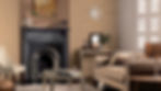
Having said that, in totality there is no getting away from the fact that more hours of our lives will hopefully be spent in our homes. And although most of that time will be spent sleeping, a significant junk of it will also be spent relaxing and lounging alone or with friends and family. Click images for details

Although we have said that the lack of spare time to decorate and maintain may influence the breadth of the projects that we undertake, it should not have to influence good design and our choice of materials, colours, accessories, and the expression of our personal taste and style. Good design can be summed up as living harmony and cohesiveness, and don't interpret this to mean conventional or boring! Click images for details


Defining Harmony and Cohesion
Let’s take a look at the dictionary definitions for harmony and cohesion - they are defined as to be in agreement in action, sense or feeling, and to be well integrated and unified. Overlaying these definitions on interior design, you can see that this translates to ensuring all our core constructs of interior design, space, shapes, lines, light, colour, texture and patterns are in agreement and well integrated with one another. Harmony will increase the perceived value of your design project. Click images for details


Harmony and Cohesion is being in agreement in action, sense of feeling and to be well integrated and unified
Know that colours are key, they are the foundation and often the starting point of our design, and wrong choices early on in the creative process can near ruin the outcome. Avoid using too many colours or colours that do not complement one another, back to that word - are not in harmony with one another. Using different shades and tones of the same colour works really well for most spaces, take a look at our blog post on Blush Pink Interior Design Trends and Monochromatic Colour Scheme for examples. Click images for details

Core constructs of interior design: space, shapes, lines, light, colour, texture and patterns need to be in agreement
Going back to the issue of time to decorate and maintain, even though our time may be on a budget, our choice of colours, textures, fabrics, lighting, style and elements, should never be compromised. Click images for details


Interior design is very individualistic, and very much like fashion, whatever a person’s taste and style is, the best results are always achieved when all elements come together seamlessly, complimenting one another with perhaps a piece or two taking subtle centre stage as the statement piece. Click images for details


Inspiring interiors start with careful consideration of the architectural design of the home. Is the build contemporary or classic or period?

If for example the interior architecture of your home is modern contemporary, you are encouraged to unleash your creativity by including period pieces if that is the vision for your design, but you need to consider how these pieces will complement the existing modern structures, the walls, features and any permanent colours that cannot be easily changed. You certainly don't want to be overloading your space with classic elements when fundamentally the underlying architecture is modern. The same applies in reverse, period homes can work with modern contemporary elements incorporated, but how you include them is key to delivering a beautiful interior.

Inspiring interiors start with careful consideration of the architectural design of the home
Contrasting themes are a good thing and for example make for an interesting feature wall, but as an example to demonstrate harmony and cohesion, you might want to veer away from having a picture from the Mona Lisa era mounted on a classic frame right next to Andy Warhol type pop art mounted on brightly coloured frames. And if a picture is large it may compliment the room much more if it is hung stand alone with overhead lighting to accentuate it rather than cluttered with smaller frames. Ideas for feature walls are covered in our Easy Creative Feature Wall Ideas blog post. Click images for details

Whatever time you have available, enjoy your interior design! For more ideas and inspiration visit our Inspiration pages, check out Our Picks and be sure to follow us on Instagram and Twitter!


