Colour Blending Your Interior Design
- interiordesignpantry
- Mar 3, 2019
- 2 min read

Are you having a difficult time trying to match the colours of the different pieces in your room’s colour scheme?

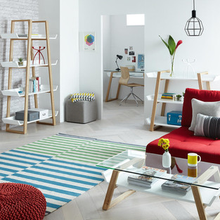
We’ll let you in on the secret of how the best in business of interior designer solve this problem - they blend the colours in the room instead of matching the colours. Yes, that might not have read as ground breaking as it is, but trust us it works and you can do it too! Click images for details

In fact, we highly recommend this design method because it will allow you the freedom of being able to easily incorporate many more exciting pieces into your room’s colour scheme and it will also make your life much easier since you won't end up going stir crazy trying to make all of your room’s decor match perfectly!

How do you determine which items blend?
How do you determine which items blend in your room and which items don't?
This is where we refer you back to one of the fundamentals of design, the colour wheel. Understanding your colour wheel is not only a design fundamental, it gives you a clear and practical visual on which colours blend well with one another. Colour wheel secondary colours are made by mixing primary colours, tertiary colours are made by mixing secondary colours and the primary colours themselves, red, blue and yellow cannot be made by mixing any other colours.

Blending colours using your colour wheel can be achieved by first picking up the key colours that you want in in your room décor and then finding a colour that compliments it. On the colour wheel, complimentary colours will sit opposite your key colours, analogous colour blending will have you using colours that sit side by side to each other, and triadic colour blending will have you using three colours equally spaced apart on the colour wheel. There are other colour wheel techniques such as split complimentary, and square but we won’t go into those in this post. Click images for details

If you can’t quite wrap your head around using a colour wheel, trust your eye for colour or seek out a second opinion from a friend or family member with a good eye for colour.


This method of blending not matching is especially helpful when you're working with a pattern that may take on one general colour when viewed from a distance. We also like to take a close look at each patterned piece to see which colours they're comprised of to see if the piece is a good fit. Be sure to have fun, remember be creative, your design your rules (with a touch of blending and not matching)!

You can find more fun and exciting design and decorating tips on our blog which features and be sure to check out Our Picks page and enjoy your new design!
Follow us on social media! Pin us on Pinterest!


Comments